Choosing the Right Painting Size: A Practical Guide for Any Interior
The choice of a painting for an interior is most often determined not by taste or budget, but by scale. Even a powerful work can look pitiful if it is too small for the wall, and vice versa — it is inappropriate to press if its size does not correspond to the space. Designers have known this for a long time, and the rules here are surprisingly precise, almost mathematical.
The principle used by professional designers
There is an important basic rule that is best not to ignore, and which we recommend keeping in mind when choosing the right size.
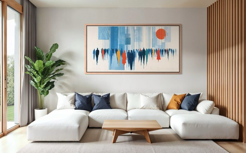
The painting should occupy 50 to 75 per cent of the width of the wall or furniture above which you are hanging it.
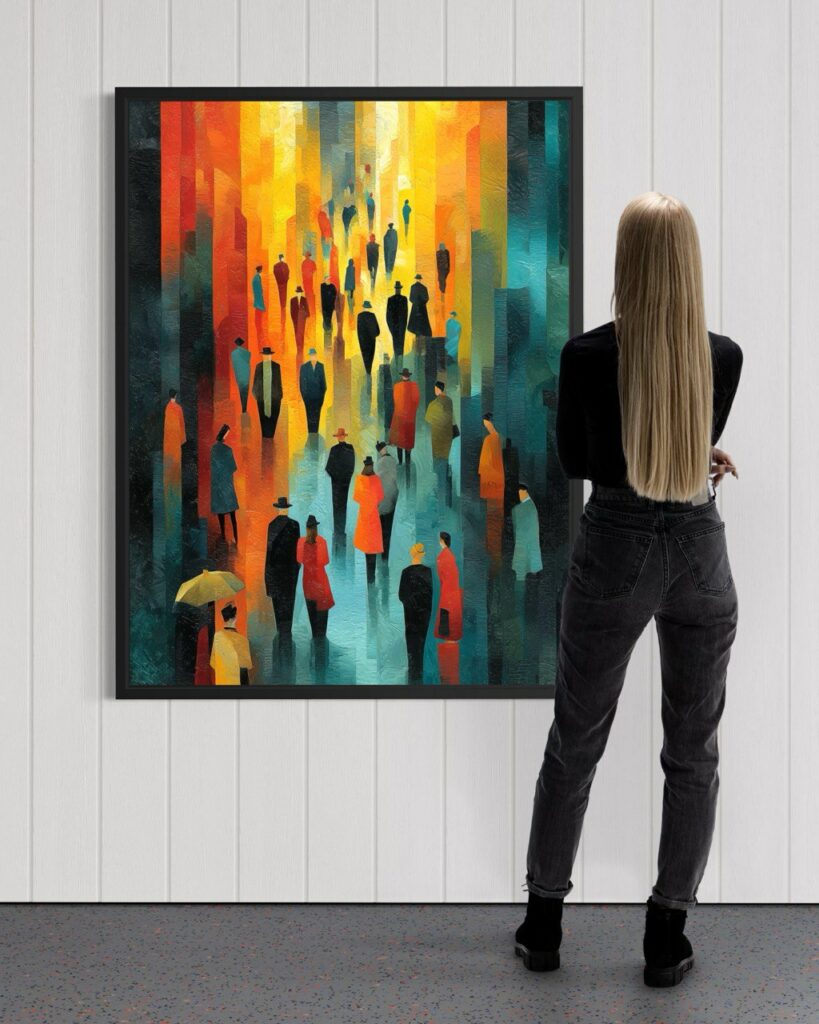
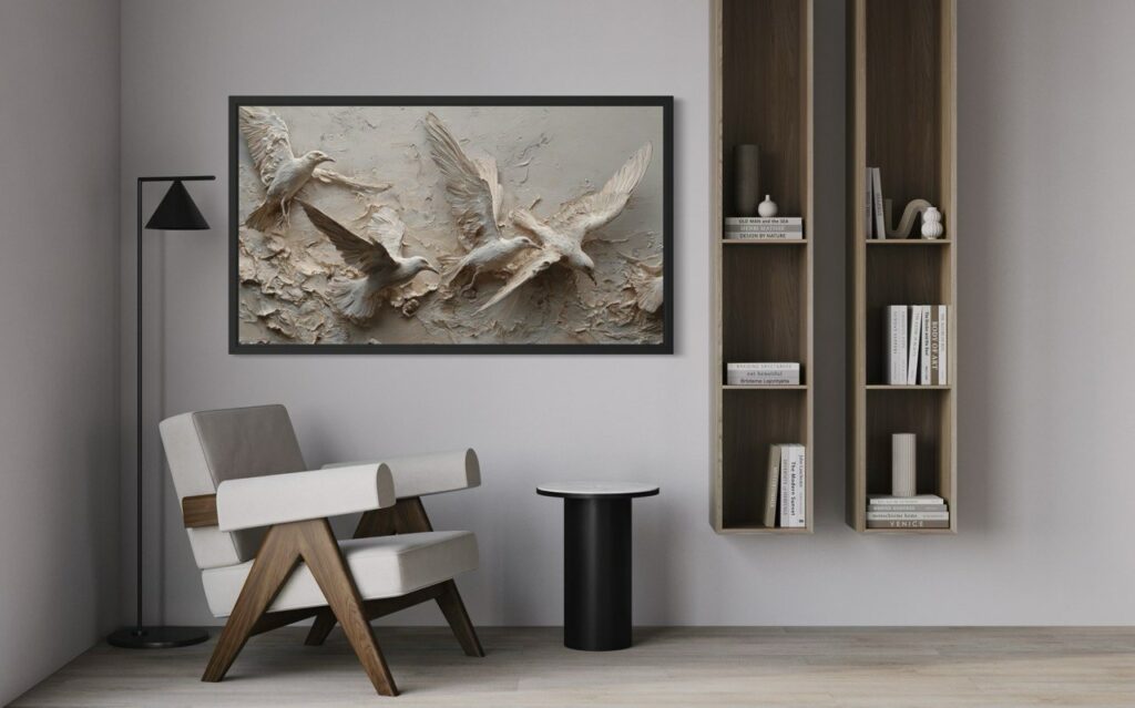
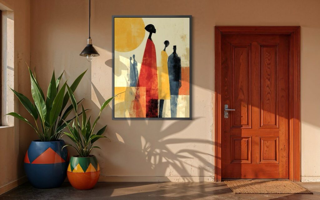
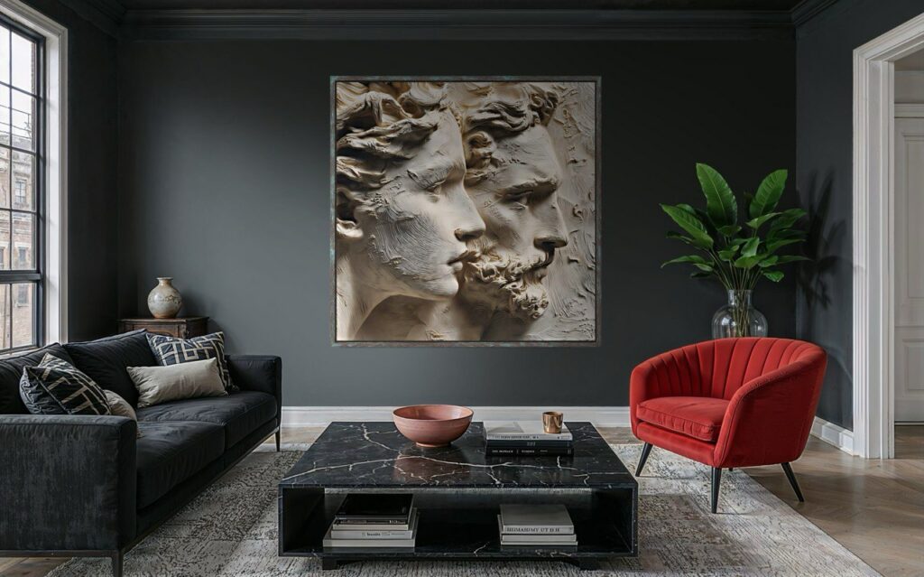
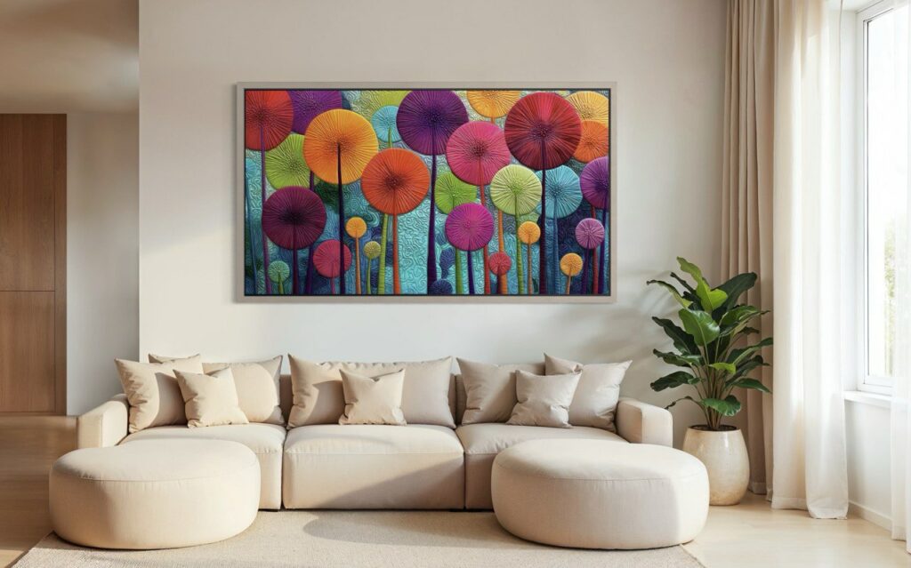
All photos — EdemWeiss online store
This rule was already used in 19th-century salon hangings, when artists and curators noticed that these proportions are perceived by the eye as ‘complete’.
If the work hangs above a sofa, bed or chest of drawers, its optimal width is approximately two-thirds of the width of the furniture. In other words, above a 210-centimetre-long sofa, a 140-centimetre-wide painting looks neat and confident, rather than like a random object.
The same logic applies to a blank wall. Half is the minimum, three-quarters is the comfortable maximum. Anything smaller will be visually ‘lost,’ especially in modern interiors with open spaces.
Read: The meaning and characteristics of colours
How scale artworks in series and paired works
When there are two or three works on the wall instead of one, the width rule does not disappear; it simply begins to apply to the entire composition at once.
Diptychs
Two works are perceived as a single whole, even if there is space between them. Therefore, it is not the size of each painting that needs to be considered, but the total width of the composition together with the distance between them.
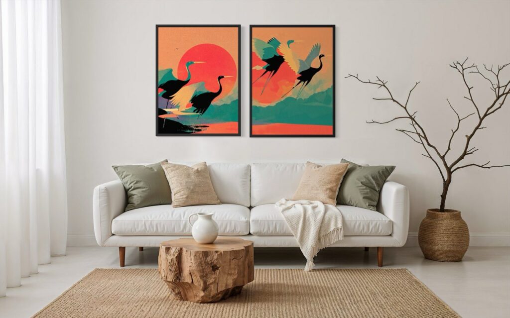
Practical guideline: the total width of the diptych should occupy the same 50-75 per cent of the wall or furniture below it.
Distance between works:
- 5–8 cm for medium formats
- 8–12 cm for large works
If the distance is increased further, the diptych will visually fall apart and cease to be read as a pair.
Formats
- A vertical diptych works well in narrow spaces and with high ceilings
- Horizontal works well for long walls and areas above a sofa or bed
Triptychs
A triptych always dominates. It ceases to be an accent and becomes the main architectural element of the wall.
Ideally, a triptych should occupy not 50-60%, but rather 70-75 per cent of the wall’s width.
The central work can be:
- slightly wider
- or visually denser in form
The side parts do not have to be mirrored, but the rhythm between them should be clear at first glance.
If the room is less than 15 square metres, it is better to make the triptych compact in height, otherwise it will begin to feel oppressive.
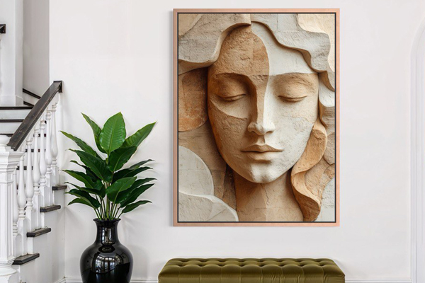
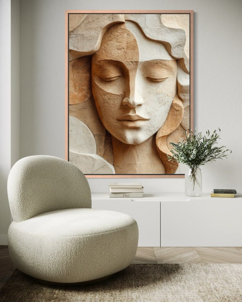
Framed painting, with or without a mat
The design directly affects how the viewer perceives the scale.
Advantages of unframed paintings
- The work looks larger than it actually is.
- Suitable for modern interiors and large formats.
- Works well if the wall surface is calm and uniform.
With a frame
- The frame visually brings the image together and makes it look more formal.
- The more massive the frame, the more compact the work itself appears.
- For small rooms, it is better to choose thin frames.
Matte
A matte increases the breathing space around the image but reduces its visual mass. This is a good option if the work itself is rich or detailed.
On large walls, a mat visually reduces the size of the picture, even if the size of the picture is chosen correctly in terms of the ratio between the size of the wall and the picture.
📍Historical fact (this rule can be used today if necessary)
In 19th-century salon-style interiors, passe-partouts were used as a visual pause: they softened the richness of the image and helped to integrate the work into the dense, almost continuous hanging of the walls.
When rules can be broken
There are rare cases when a picture can be made smaller than the calculated size:
✅ if it is part of a series on several walls
✅ if the work is intended for intimate, private viewing
✅ if it is integrated into a complex composition of light, texture and furniture
In all other cases, the scale rule works flawlessly, regardless of interior style and fashion trends. For such complex design solutions, you will most likely need a professional who understands what they are doing and why.
Ceiling height is more important than it seems
The vertical size of a painting is directly related to the height of the ceiling. In flats with ceilings 2.4–2.6 metres high, works 60–90 centimetres high work best. They do not fragment the wall and do not create the feeling that something has been ‘crammed in’.
You might also enjoy: A True Story: Active Listening
When ceilings are higher — 2.7–3 metres and above — the painting can and should grow. Formats of 100–120 centimetres and above are perceived organically, especially when it comes to verticals or diptychs. Incidentally, this is why Parisian apartments with high ceilings so often feature elongated portraits and series of works rather than single small canvases.
The rule of the centre, which almost never fails
The gallery standard sounds boring, but it works flawlessly: the centre of the painting should be 145–155 centimetres above the floor. This is the average human eye level, and it does not change in a museum or an apartment.
📍Interesting fact
This rule became established in museum practice only in the 20th century, when exhibitions began to focus not on the architecture of the hall, but on the viewer’s perception. Later, designers began to apply it when planning and decorating private interiors.
The size of the room dictates the scale
A small painting in a large room does not look minimalist, but lost. A space of 10–14 square metres can easily accommodate works measuring 50–80 centimetres. Rooms measuring 15–20 metres can accommodate works measuring 70–110 centimetres. In large rooms measuring 30 metres or more, individual works smaller than 120 centimetres often simply do not work, but series and large formats look expensive and meaningful.
Distance from the viewer
The further a person stands from the wall, the larger the work should be. At a distance of four metres, the eye can no longer make out small details, and the picture turns into a blur. This is why small formats almost always lose out in spacious living rooms and halls.
Format matters
Vertical works visually elongate the space and help low ceilings to “breathe”. Horizontal works expand the wall and fit perfectly into the space above sofas and beds. By the way, a square is the most demanding format. It only looks good if it has enough space on all sides; otherwise, it looks cramped.
Important
If you are unsure which size to choose — one that is slightly smaller than the standards above — we recommend choosing a larger one: large accents look better in a modern interior. Small paintings rarely look expensive, unless they are part of a well-thought-out series.
If, after all these rules, you finally have a clear picture in your mind and understand what size work you need, the logical next step is simple. Follow the link, look at real examples in interiors and choose the format that will work on your wall. Size in art matters more than it seems, and this is easy to verify in practice.